
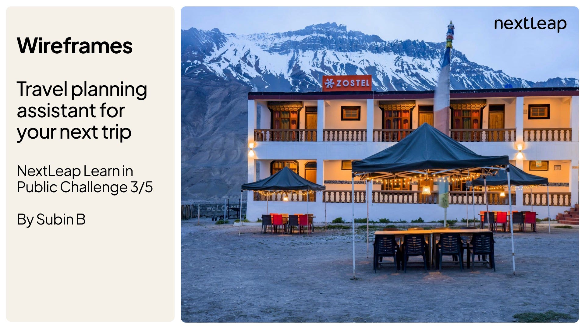
Behind the Scenes: Zostel Itinerary Planner
Drawing inspiration from lived experiences

Hello there! Look who finally remembered the existence of their newsletter! 😬
Welcome to Product, a new section where I post about my journey to product management. This edition covers my thought process while creating wireframes for a travel platform.
The Problem Statement
As part of NextLeap’s Learn in Public challenge, the cohort was tasked with creating wireframes. The problem statement reads as follows:
“You need to create wireframes for a travel planning assistant on a travel platform (eg. MakeMyTrip/Expedia etc). Assume that the assistant is powered via OpenAI or similar technologies and is completely automated. The assistant is an attempt to help potential customers get inspired, plan their travel itinerary faster and help them in the travel booking journey. Remember, it is NOT a chatbot.”
Initial Thoughts
As someone who has never created wireframes, I felt a little lost in the beginning, to be honest. I had a high ambition though. I wanted high-fidelity wireframes that looked visually appealing. Since I’ve never really used Figma for designs before, I knew it was going to take a while to get accustomed to the interface. (Thanks to my designer friends for clarifying my noob queries!)
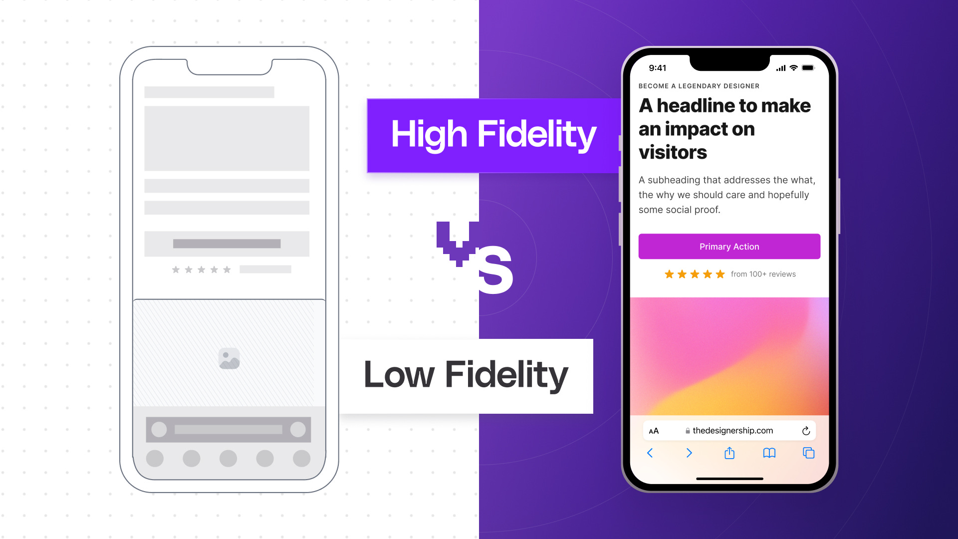
For the uninitiated, a low-fidelity wireframe highlights the core structure of the screen. A high-fidelity wireframe is a detailed version of the screen with all the UI elements and images, something developers can refer to get to their final front-end output. Here’s a nifty comparison image that conveys the idea:
One might argue that it is not about fidelity and is more about what you create, to which I partially agree. I think if you don’t make it presentable, your chances of getting eyeballs on what you have created decrease significantly.
Of course, I didn’t set out to be a product designer with this challenge. In fact, I have a newfound respect for all the product designers out there, who transform rough ideas into visually pleasing artifacts.
Choosing the Travel Platform
The first thing I had to do was finalize a travel platform. The examples given were of travel aggregator platforms (Makemytrip, Expedia). However, I chose to go with Zostel.
Zostel? Isn’t that a hostel, you ask? It is. However, one insight I have that led me to choose Zostel over other platforms is the target audience. People primarily come to Zostel when they travel, not when they’re just looking for accommodation.
As the company puts it, “A pioneer of the new-age travel culture in India, Zostel is also the world's largest backpacker hostel chain. Stay with us at 60+ destinations across India and Nepal, exploring remote locations, remote parts of famous locations, and unconventional experiences on your holiday.”
Finding the Right Problem to Solve
With the app finalized, I went on to think of ways to integrate a planning assistant into Zostel, which is not a chatbot. Customer chat support? Maybe. Smart trip destination suggestion based on trip history, why not? Ideas went in and out until I remembered one thing: my solo trip to Chitkul!

You see, when I booked my tickets to Chitkul, I had no idea about the places to visit there. I postponed that as tomorrow me’s problem and thought I’d figure it out eventually. When I arrived at Chitkul, I was pleasantly surprised to see this board right outside the reception:

All the nearby top attractions were listed there, along with the distance from Zostel. This drastically simplified my efforts to plan my days in Chitkul. My hypothesis also strengthened when we naturally started sorting places to visit by the distance from Zostel Jaipur for an upcoming Jaipur trip (if weather permits!).
With these two anecdotes, I decided to create a trip itinerary planner that lists the top attractions near Zostel. Solo travelers and the planning-obsessed can utilize this to add a pinch of certainty to their trip. Off I went to sketch out early pen-and-paper wireframes of how the feature should look.
Early Wireframes
I decided to add a “Top Attractions” page on the Zostel landing page, where users can view the top attractions near the Zostel. Users can sort either by relevance or distance from Zostel. There’s even an option to download a PDF copy of your itinerary before you book the stay, say for times you have to revisit the plan or discuss with friends or family.

The initial wireframe had food delivery app-esque card layouts, which I later changed to match the larger cards of the Zostel app. After the trip, users can rate the itinerary, which then creates a feedback loop for the recommendation system to improve.
Final Wireframes | Slide Deck
With all that said, here’s the final slide deck featuring the wireframes:
PS: I’ve created a separate section for Product Management-related posts and have not copied over the subscribers from my other sections here. If you’re here for my random ramblings, I won’t force you to go through these. That said, if you like what you read, feel free to subscribe! :D
Until next time,
Subin